When to Rebrand a Creator Brand: What We Learned When Our Logo Kept Reading as Kevin Durant's
Knowing when to rebrand a creator brand comes down to four signs of audience confusion. The KDCC rebrand and the Kevin Durant logo moment is the case study.

Knowing when to rebrand a creator brand, whether the brand sits on a YouTube channel, a community, or a creator-led business, is a decision most working creators get wrong, and the most reliable trigger is not a feeling, it is consistent confusion from the audience the brand is supposed to be reaching. The Kan Do Creators Community recently retired its original KD Monogram Logo after enough creators kept asking whether the brand was a Kevin Durant fan account, and the rebrand that followed is the case study underneath this post. The walkthrough below covers when to rebrand, what to actually change inside a YouTube channel rebrand specifically, what to leave alone, and how a working creator can apply the same framework whether the brand lives on YouTube alone or across YouTube, a blog, a newsletter, and a community.
What does it mean to rebrand a creator brand?
A creator brand rebrand is a deliberate refresh of the visual and verbal identity of a creator-led brand, covering the logo, the color palette, the typography, the tagline, and the positioning language the brand uses to introduce itself. The work applies across formats, because the modern creator brand sits on more than one surface at once. A working creator brand could be a YouTube channel, a podcast, a newsletter, a photography practice, a community, or some combination of all of those, and KDCC itself was built for creators in every format, with the brand bible positioning the community as "the room for whatever you make, for first-timers and people who have been at it for years." A rebrand is different from a one-off update. A new thumbnail template is not a rebrand. A different intro music cue is not a rebrand. A rebrand is the moment when enough pieces of the identity are changing together that the whole system gets rebuilt as one decision, with one strategy underneath it.
For a working creator, the rebrand is one of the most consequential moves available, because the brand is what the audience encounters before any video plays, and it is what AI answer engines and search engines tie back to the creator when someone searches for the channel by name. A clear, distinct brand sets up everything downstream, including click-through rate on thumbnails, search and AI recognition of the creator's name, and the time the creator has to spend explaining who they are before getting to the actual work. A confusing brand drags on everything downstream in the same way, which is why the decision of when to rebrand matters more than most creators give it credit for.
When is the right time to rebrand a creator brand?
The honest answer is that most working creators wait too long, because the brand they built at the start has emotional weight that the brand they need at the next stage does not yet have. The reliable trigger is consistent audience feedback rather than personal taste, and the four signs below are the ones worth watching.
The first sign is when the audience consistently misreads the brand. If creators inside and outside the audience keep asking what a logo means, or confusing the brand with a different brand, or guessing at what the channel is about from the name, the brand is failing the only test that matters, which is whether it lands without explanation. The Kevin Durant moment that triggered the KDCC rebrand is a clean version of this sign, because a two-letter monogram that everyone associates with a basketball player is doing the opposite of brand-building work for a YouTube creator community.
Look, Kevin Durant is a great basketball player, and the comparison is not a knock on him, it is a knock on what the comparison was doing to the brand we were building. The honest part of the story is that Ike and I never thought of the Kevin Durant connection when we put the original KD Monogram Logo together, and the first few times creators raised it really took the wind out of our sails, because the brand we had spent months building was reading as something we had never been trying to build.
The second sign is when the brand cannot stretch to where the work is going. A brand identity built for a single channel banner and a single thumbnail template falls apart the moment the creator adds a blog, a newsletter, a Discord, a merch store, or a membership program, and the palette and typography start fighting the format instead of carrying it. A two-color launch palette will work for a single thumbnail style, and it will collapse the moment the work spreads across more than one surface.
The third sign is when the audience the creator is actually reaching no longer matches the audience the brand was designed for. A brand built for a beginner audience reads as juvenile to an intermediate audience, and a brand built for a niche audience reads as confusing once the creator has broadened the scope of the channel. Audience drift is real, and the brand needs to drift with it rather than against it.
The fourth sign is when the creator is the only person defending the existing identity. If every collaborator, every advisor, and every honest member of the community has gently raised the brand question, and the creator is the only voice arguing that the current identity is fine, the brand is already past due. The KD Monogram Logo was the piece I defended the longest, and the defense was sentimental rather than strategic, which is a posture most creators sit in for at least a year before they admit it.
How do you know your logo is not working?
A logo that is not working sends one of three signals, and the signals are loud once a creator learns to read them. The first signal is the explanation problem. If a creator has to explain the logo every time it shows up, the logo is failing. A brand mark that needs a paragraph next to it is a brand mark that is not doing its own work, and the KD Monogram Logo fit this pattern exactly, because the conversation with new community members almost always started with the question of whether KDCC was somehow related to Kevin Durant.
The second signal is the comparison problem. A logo that consistently reminds the audience of another brand is a logo that is borrowing equity from that brand rather than building equity for the creator. The comparison is rarely intentional on the creator's side, and the audience does not care that the resemblance is accidental, the resemblance is the read.
The third signal is the recognition problem. A logo that the audience cannot describe back to the creator without looking at it is a logo that is not landing. A creator can run a quick test by asking three honest community members to sketch the logo from memory, and the gap between what comes back and the actual mark is a measurable read on how much recognition the logo has actually earned.
What changes in a real creator brand rebrand?
A real rebrand changes the parts of the identity that are doing the work and leaves the parts that are still earning their place. The KDCC rebrand is a fair example, because the pieces that moved are the pieces that were not landing, and the pieces that stayed are the pieces that were.
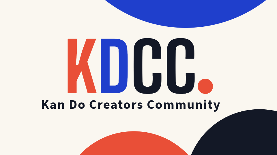
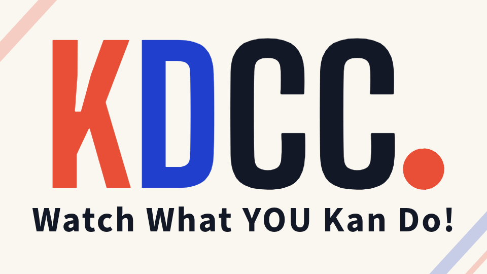
The logo is the first piece that usually moves. The old KD Monogram Logo was retired, and the new KDCC Logo took its place. The new mark is a full wordmark, KDCC. with a period that is part of the mark, and the color logic carries the brand identity inside the wordmark itself. The K is set in Tomato, the D in Cobalt, the CC in Asphalt, and the period in Tomato. The four letters and the period spell out the entity name and carry the brand's two primary colors and the working neutral inside a single mark, which means the visual identity and the text identity match exactly.
The new KDCC Logo is built as a system rather than a single asset, with six lockups for the contexts a creator brand actually has to work in. The Primary lockup pairs the wordmark with the full "Kan Do Creators Community" line for hero and pitch contexts. The Compact lockup is the wordmark alone at favicon and avatar sizes. Four lockups in between cover editorial moments, square slots, email signatures, and the written-out long form. A separate Badge treatment places the wordmark inside a rounded square for app icons, profile tiles, and merch labels. We used a designer, who designed the new system, built the lockups so the same logo lands cleanly on a thumbnail, a Discord role flair, a podcast cover, a business card, a stream overlay, and a favicon without any of them collapsing into the same treatment.
A wordmark logo is harder for an audience to misread than a monogram logo, and it is also stronger for search and AI recognition, because the visual identity matches the text identity. A KDCC Logo that is also the entity name is a logo that pulls double duty on every surface it lands on.
The other piece of feedback we kept hearing on the old KD Monogram Logo was that it was cute, which a few creators offered back to us as a sincere compliment and a few offered back to us as a polite version of "not quite professional enough." The reception on the new KDCC Logo has been the opposite of both of those reads, and the number of community members who have written in unprompted about how the new identity finally looks like the work the community is actually doing has honestly blown both Ike and me away. That part of a rebrand is the part that is easy to forget when a creator is sitting in the chair arguing with themselves about whether the current logo is fine, because the reception is the proof that the decision was not sentimental, it was overdue.
The color palette is the second piece, and it is the piece that traveled the furthest in the rebrand. The launch identity ran on two colors, teal and salmon, and a lot of the day-to-day brand decisions ran out of room inside that two-color system. The new palette covers ten colors, with six core colors that do ninety percent of the daily work and four extended colors reserved for accents.
The six core colors are Cobalt at #1F3FCC, Tomato at #E94F37, Asphalt at #131826, Buttercream at #FFE4A8, Cement at #B8B5AC, and Off-White at #FAF7F0. The wordmark itself runs on the first three, with K in Tomato, D in Cobalt, CC in Asphalt, and the period in Tomato. The other three carry the chrome, the body backgrounds, and the neutrals that hold the system together across longform reading, navigation, and onboarding states.
The four extended colors are Sage at #A4AE93, Plum at #6B4F6E, Butter at #F2C14E, and Lime at #C8DC4F. Each one carries a specific job inside the system. Sage covers community and longform editorial moments. Plum is the premium and members-only color, reserved for paid-tier and bonus content. Butter is the warmth-and-energy color for live streams and fundraisers. Lime is the pop-and-launch color for drops and announcements. The rule across the extended set is that no more than two of them appear in the same composition, because three of them at once turns into noise.
The decision to expand from two colors to a ten-color system was not made all at once. The rebrand started with two colors carrying over from the launch identity, expanded to a working five-color set in the middle of the process, and landed at the final ten-color system once it was clear that a Discord role flair needs a different signal than a podcast cover, and a paid-tier card needs a different signal than a newsletter banner. Our new system paired the ten colors into ten named combinations and ten named gradients inside the brand book, with names like Signature, Heat, Electric, Premium, and Punk on the combination side, and Signature Fade, Sun Fade, Night Fade, Premium Fade, and Velvet Fade on the gradient side. Each pairing and each gradient has a context attached, which is what lets a working creator pick the right combination for the right job without guessing.
The typography is the third piece. A creator brand built on a single typeface tends to look like a launch identity, because the typographic range needed for a thumbnail, a longform blog, a newsletter, and a slide deck is genuinely different. The new KDCC type stack covers four families. Big Shoulders Display carries the wordmark and the hero headlines. Source Sans 3 carries body copy across the blog and the newsletter. DM Serif Display carries the tagline and editorial pullquotes, set in italic. IBM Plex Mono carries technical labels and metadata, including the hex-code captions that appear inside the brand book itself. The split gives every surface the right reading rhythm, with the display face carrying recognition across thumbnails and headers, the body face carrying the longform reading, the serif italic carrying the tagline moments where the brand says "Watch What You Kan Do!" in its own voice, and the monospace carrying the technical structure underneath the brand system.

The tagline is the fourth piece, and it is the piece most creators underweight. The KDCC tagline shifted from "You Kan Do It Here," which framed KDCC as a location a creator arrives at, to "Watch What You Kan Do!" set in italic DM Serif Display. The new line puts the emphasis on the creator and the work the creator is about to put into the world, with the italic treatment doing the typographic work of leaning into the word "You" inside the brand system. The shift is small in word count and large in posture, because the new tagline points outward at the creator rather than inward at the community. The launch-era "You Kan Do It Here" line did not disappear entirely, the line now lives inside the Beginners-tier framing as the welcome-and-permission language for the first-time-creator audience, and the brand-level tagline carries the new "Watch What You Kan Do!" line across every other surface.
What did not change is worth flagging too. The personal signoff I close every post with, "If I Kan, You Kan Too," sits separate from the brand tagline, because a signoff is the personal closing line of a specific author and a tagline is the brand-level line that lives across every surface. The two travel together, and conflating them is one of the easier mistakes to make in a rebrand.
What does a YouTube channel rebrand specifically involve?
A YouTube channel rebrand has its own surface list, and the surfaces are different enough from a general creator-brand rebrand that they deserve their own section. The working YouTube creator going through a rebrand has to think about six platform-specific touchpoints in addition to the logo, palette, typography, and tagline decisions covered above. Skipping any one of them is the most common reason a rebrand reveal feels half-finished to the audience, because the YouTube viewer encounters the channel through these surfaces before they ever see a thumbnail or a blog post.
The channel banner is the first surface. The banner sits at 2560 by 1440 pixels with a safe area of 1546 by 423, and a banner that does not carry the new logo, the new palette, and the new positioning line is a banner that signals to a returning subscriber that nothing has changed. The KDCC banner across our YouTube presence carries the new KDCC Logo, the new palette anchor on KDCC dark, and the new tagline in the center safe area, because the banner is the first thing a viewer sees when they tap the channel page.
The channel profile picture and channel handle are the second and third surfaces. The profile picture is the image that follows a video around the platform, showing up next to every comment, in every notification, and in the subscription feed. The channel handle, which is the @ name a viewer types when looking for the channel directly, has to match the new brand name closely enough that a viewer who searches the handle finds the channel without effort. A rebrand that updates the banner and forgets the profile picture is a rebrand the platform spreads inconsistently.
The watermark and the end screens are the fourth and fifth surfaces. The watermark is the subscribe-prompt overlay that floats on every video, and a watermark that still carries the old logo is a watermark that quietly undermines the new identity on every play. The end screens carry the same problem at the end of every video, with the subscribe button card, the recommended video card, and the channel branding card all needing to land in the new system.
The channel trailer is the sixth surface, and it is the one creators forget the longest. The channel trailer is the video a non-subscriber sees when they land on the channel page, and a trailer recorded under the previous brand reads as outdated the moment a new viewer arrives. The trailer does not need to be re-shot every rebrand, the trailer needs to be re-edited or replaced with a short rebrand-announcement video that introduces the new identity directly.
For the working YouTube creator going through a rebrand, the practical move is to build a checklist of these six surfaces in addition to the broader creator-brand work, and to roll out the surfaces in the same week the rebrand goes public, because a half-finished YouTube rebrand reads as a half-finished commitment.
How should a working creator approach a rebrand?
The first move is treating the rebrand as a strategy decision rather than a design decision. The strategy decision is who the brand is for, what the brand should do for that audience, and where the brand needs to operate across surfaces. The design decision is downstream of the strategy decision. A rebrand that starts at the logo and works backward almost always produces a new logo that solves nothing, and a rebrand that starts at the audience produces a logo that lands.
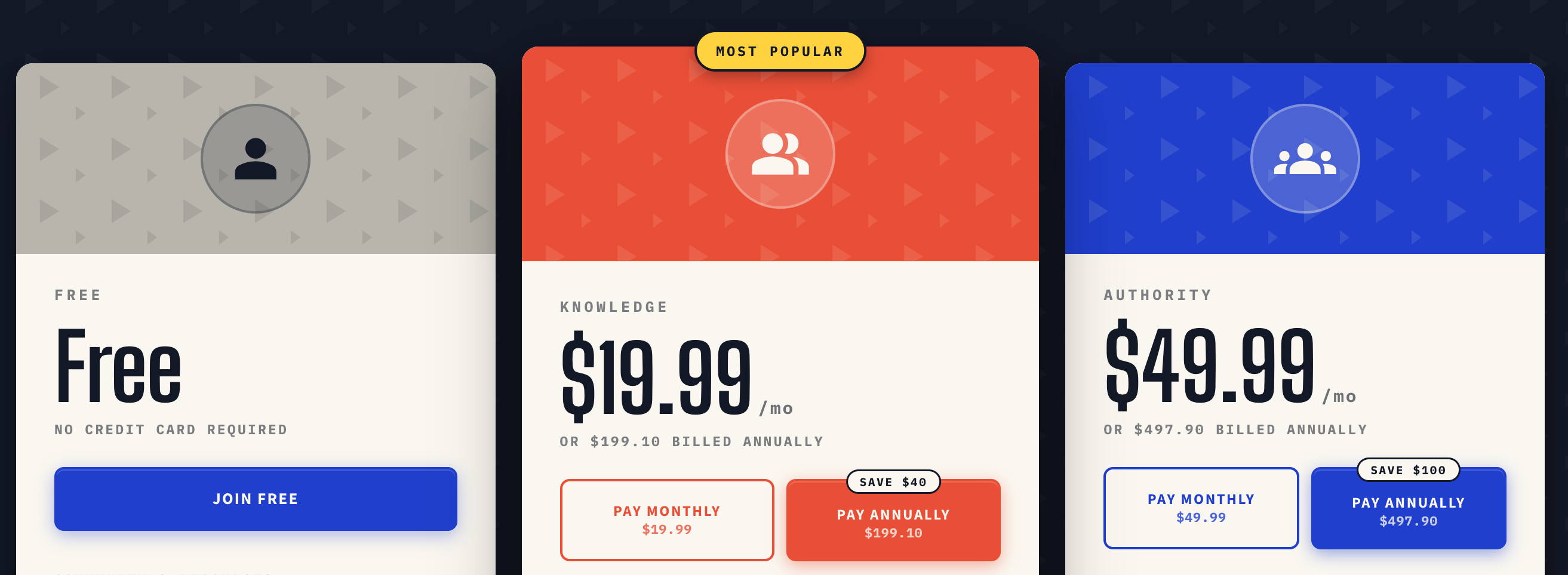
The second move is auditing the surfaces the brand will live on. A creator running only a YouTube channel has a narrow surface area, a creator running a channel plus a podcast plus a newsletter plus a Discord has a wide surface area, and the brand has to be built for the surface area the creator actually has. The ten-color KDCC palette exists because KDCC operates on a Ghost blog at blog.kdcc.social, a community hub at kdcc.social, a Discord with over two thousand five hundred members, a newsletter, the free YouTube Glossary and Creator Dictionary, the YouTube Audience Visualizer, and a tiered group coaching program serving Beginners, Indie Creators, Full-Time Pros, and Multi-Format Makers. A creator running only a single channel does not need ten colors, the creator running everything KDCC runs does.
The third move is testing the new identity in low-stakes contexts before the public reveal. A rebrand reveal is a one-shot announcement, and the cost of catching a problem after the reveal is much higher than the cost of catching it in a private test. A new logo should run on a few in-progress thumbnails, a few internal Discord posts, and a few drafts of the next newsletter before the announcement goes live to the wider audience.
The fourth move is documenting the rebrand publicly. The post the audience reads about why the brand changed is itself part of the brand, and a rebrand that lands without explanation is forgettable, while a rebrand that lands with a clear story behind it is the rebrand the audience defends alongside the creator. This post is part of that work for KDCC, and any working creator going through a rebrand should write a version of it for their own audience.
What about the AI search surface, and why does it matter for a creator brand?
The AI search surface is the part of the rebrand decision most creators are not building for yet, and the working creator who builds for it gets a head start that compounds over the next twelve months. AI answer engines like Google AI Overviews, ChatGPT, and Perplexity are already where a meaningful share of creator-relevant queries end up, including queries like "best YouTube channel rebrand examples" and "when should a YouTube creator rebrand," and the answer engines reward brands whose logo, entity name, founders, platforms, and tagline all line up into one coherent signal.
A creator brand with a confusing logo, an inconsistent name, and a tagline that drifts across surfaces is a brand the AI engines cannot confidently cite, because the engine has to guess at which signals to trust. A creator brand with one KDCC Logo, one canonical name, one set of platforms attached to that name (a YouTube channel, a Ghost blog, a Discord, a newsletter, the YouTube Glossary, and the YouTube Audience Visualizer), and one tagline carried across surfaces is a brand the AI engines can pull into an answer cleanly. The rebrand is the moment to set up the entity for that surface, because every signal that ties the brand together is a signal the engine reads as authority.
The KDCC rebrand is built with this surface in mind. The new KDCC Logo is the full community name, the JSON-LD schema on every blog post carries the publisher entity, the founders, and the YouTube-anchored platforms together, and the tagline lives at the brand level on every surface the community operates on. The AI answer engine that reads any single post about KDCC reads a coherent identity, and the citation that follows is the work the rebrand was doing all along.
Where does the KDCC rebrand show up next?
The Discord is the first place to see the new KDCC identity in motion, with role flairs, member tier indicators, and channel headers all running on the new system at kdcc.social. The newsletter is the second surface, and the next issue carries the new banner, the new typographic treatment, and the new "Watch What YOU Kan Do!" tagline placement, with the newsletter signup at kdcc.social/pages/newsletter for any working creator who wants the weekly translation of YouTube platform changes.
The blog at blog.kdcc.social is the third surface, and every new post from here forward is written into the new identity. The free YouTube Glossary at kdcc.social/pages/youtube-glossary and the YouTube Audience Visualizer at kdcc.social/pages/youtube-audience-visualizer carry the new identity into the tools layer of KDCC, and the tiered group coaching program is where the new Plum extended color shows up as the premium-and-members signal across the Beginner, Knowledge, and Authority tiers.
The brand refresh is the move that unlocks the next stage, and the next stage is the same work Ike and I have been doing since the first day of KDCC, which is translating YouTube platform changes into practical playbooks the working creator can apply the same week. The visual identity is finally caught up to that work, and the new identity is built to run on top of it. The working creator reading this post and sitting on a rebrand decision of their own has the same four signs to work from, and the same framework to apply.
If I Kan, You Kan Too.